Orange Crush
Orange is the color of sunsets, harvests, and safety vests. It’s warmer than yellow, friendlier than red, and hard to overlook, which is why it ends up on traffic cones and call-to-action buttons alike. An orange background brings instant energy to a screen; the job is choosing the right orange. Below: ready-to-download orange backgrounds, the shades and codes to build your own, and the story behind the color.
Orange color codes
Gallery
A sample of ready-to-use orange backgrounds. Hover any image and hit the download button to grab the full-resolution version.



Ways to use an orange background
- Wallpaper: a warm orange wallpaper keeps a desktop or phone feeling bright; every image above downloads at full resolution.
- Plain & solid: an orange fill makes thumbnails and sale banners jump off the page; grab an exact shade below.
- Web & design: orange is the classic call-to-action color: energetic like red, but without the alarm. There’s a reason it’s the internet’s favorite “buy” button.
Shades of orange
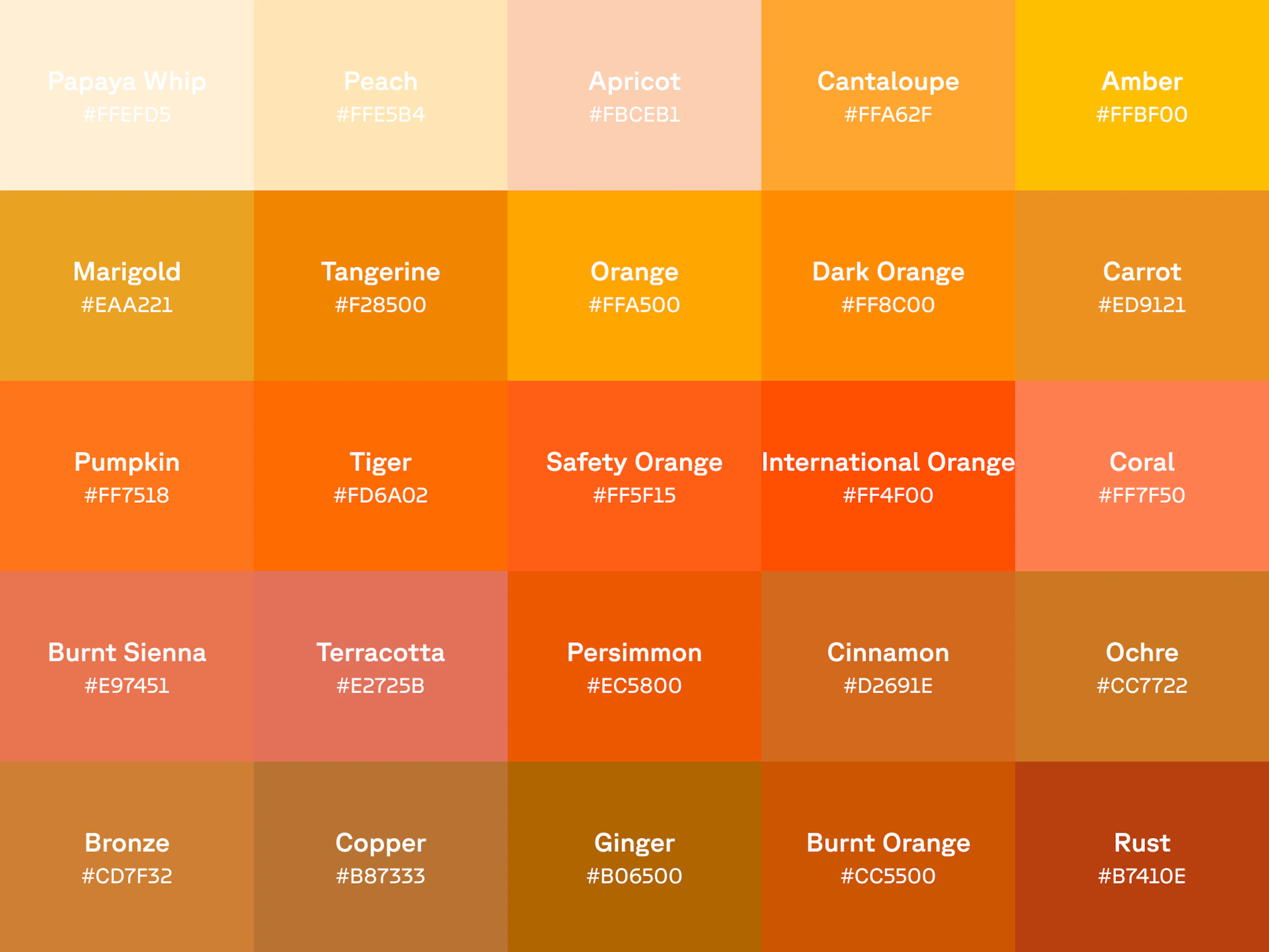
Orange covers more ground than the traffic-cone shade that comes to mind first. On the light end sit peach, apricot, and cantaloupe, soft dessert-like oranges that work almost like neutrals. In the middle are tangerine, carrot, and pumpkin: the loud, happy oranges. Push darker and orange turns earthy, with terracotta, copper, rust, and burnt orange all borrowing from clay and autumn.
Click a shade to copy its hex code, or download it as a ready-to-use background:
Warm-to-earthy is orange’s whole range: add yellow and it glows like amber; add brown and it settles into cinnamon and ochre. If red is passion and yellow is optimism, orange is the handshake between them.
Orange gradient backgrounds
A gradient is orange’s natural habitat: every sunset is one. Here are six ready-made orange gradients. Copy the CSS straight into a stylesheet, or download the full-resolution image. Want to build your own? Open CSS Gradient and roll a custom orange.
What orange means
Orange runs on two tracks: the color of high-visibility warnings, and the color of warmth and harvest.
Safety first, then sunsets
Orange is among the most visible colors in dim light and against water or sky, which is why it owns the world of safety: life jackets, traffic cones, road-crew vests, and “black box” flight recorders (which are actually bright orange). International Orange, a shade formulated specifically for visibility against fog and sky, coats the Golden Gate Bridge and colored NASA’s early spacesuits. When something absolutely must be seen, it gets painted orange.
Cultural significance of the color orange
In much of Asia, orange is sacred: Buddhist monks have worn saffron robes for over two thousand years, and in Hinduism saffron stands for purity and renunciation. In the Netherlands, orange is practically the national identity: the royal House of Orange lends its name and color to everything from the football kit to King’s Day. And across the West, orange owns autumn outright: pumpkins, falling leaves, harvest tables, and Halloween.
History of orange
The color is named after the fruit, not the other way around. For centuries English simply had no word for it: writers made do with “yellow-red” (geoluread in Old English) until the fruit arrived in Europe, carrying its name from Sanskrit nāraṅga through Persian and Arabic into French, and finally landing in English around the 16th century. Only then did the color get its name.
Painters had orange long before the word: ancient Egyptians used realgar and orpiment, two spectacularly toxic arsenic minerals, in tomb paintings. Synthetic chrome orange arrived in the early 1800s and the Impressionists ran with it; the Monet sunrise that named the whole movement hinges on a single smear of orange. And the story goes that Dutch growers bred carrots orange in the 1600s as a tribute to the House of Orange. Before that, most carrots were purple or white.
Colophon
While Cool Backgrounds is a fine resource for generating images from popular javascript libraries, the real heavy lifting comes from the library authors themselves. When it comes to customer support, Quinn Rohlf from Trianglify.js is incredibly responsive and a really smart guy to boot. Particle.js is developed by Marc Brüderlin with a wonderful API and is being actively maintained. Gradient Topography is a newly minted project by me as a response to the amazing work by the Codrops crew. And of course Unsplash is one of the best internet treasures of all time, built by the former Crew team as a side project.
Oh yea and can’t forget CSS Gradient and Rellax.js which is the “cool background” that powers those sliding parallax shapes in the content section of this site!